

At HashiCorp, we practice versioning through codification, the belief that all processes should be written, versioned, and shared. And it’s not strictly an engineering mindset; our designers are doing it too. In that spirit, we’re sharing how we updated HashiCorp Consul’s Web UI (read the blog post for that release here).
The Consul Web UI has served its users well but has been due for an update. HashiCorp has been investing in UI development, creating modern design libraries with intuitive experiences for our other products and we wanted the Consul UI to also adopt the same visual language.
»Goals
»Improve existing functionality
In this redesign, we have not added many new features. This was a deliberate choice, restricting new features only to those we deemed necessary. We wanted to improve what we have, and pave the way for more seamlessly adding features in the future.
»Consistency is key, but not at all costs
Consul should be as consistent as possible with our other HashiCorp products. For folks who are used to our other products, Consul should feel familiar. This design consistency will also make our design operations more efficient. However, we took a pragmatic approach with consistency--we found unique opportunities within Consul to do things differently. Any inconsistencies are intentional, not accidental.
»Test designs before coding
At HashiCorp, our users work with us. Our engineers are often folks that used our products at their previous employer. We’ve relied heavily on their input when designing our user experiences and visual designs because they know our user’s needs really well.
But, with this major change, we aimed to do user testing with external customers and get validation on our products before committing them to code. It’s a best practice, and we’re looking forward to doing so more often.
»Process
»RFCs: Our collaboration tool
In the middle of our product development cycle, lives the the RFC (Request for Comments document), where engineers propose technical solutions to a product challenge. The purpose of an RFC is to express intent, gather feedback, and maintain a written history of product evolution. RFCs are a form of rubber ducking for engineers, offering a chance to double check assumptions and serve as a historical record for release authors or future engineers.
Product designers at HashiCorp participate in the RFC process by providing mockups and prototypes as needed. This project was a unique case in particular because the design was the focus of the RFC, not an addendum. So, we gathered feedback in three phases:
- Round 1: User Flows and Wireframes. This felt like enough information to be worthy of a review, but still low enough fidelity (structure and layout) to keep it agile and lean.
- Round 2: Mockups & Prototype. After a round of feedback, we updated the RFC (adding overturned ideas to an “archived” section). Including the prototype at this stage helped my reviewers--who work remote around the world--asynchronously get a sense of the flow without requiring a live review session with me.
- Round 3: Final Prototype. After user tests, we replied to the RFC group with the updated prototype so that everyone would know where we landed. Any final thoughts could be added before the front-end engineers began coding it out.
The RFC process spawned great discussions, fostered idea sharing, and gave us an outlet to document our design process while sticking to agile design methods. Writing the RFC document saved us a lot of time in the long run and ensured we’re on the right track (and the same track at that).
»The Survey
We sent out a survey on Twitter, Facebook, and LinkedIn about Consul UI usage. Over 110 people responded within a week, and 86% of those said they were willing to do user testing with us. We also gathered information about the range of scope across which Consul is being used.
More importantly for design, we received data on how people feel about our UI. Half of our users only use Consul in the browser as a last resort, or not at all.
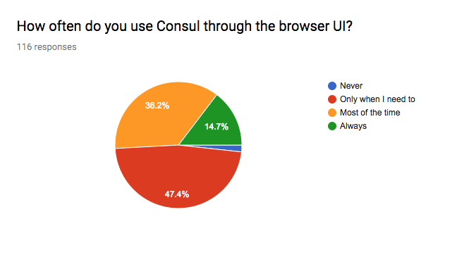
We’d like to change that. If implemented well, a client interface for Consul will have great potential for handling service discovery and health checking. Not to mention the potential it has for some of the awesome, visually oriented features on our roadmap.
»User Testing
As our designs became clearer through the RFC process, so did our user testing plan. This project is our first “official” user testing at HashiCorp, and we hope to do more. We aimed for 4-6 participants from a variety of scope and sentiment. Here’s the makeup of participants we spoke with:
We learned a lot from our user tests.
- Tags for services are depended on more heavily than we expected. Since we are going for feature parity, but we’ll leave room in the UI to build that out in the future.
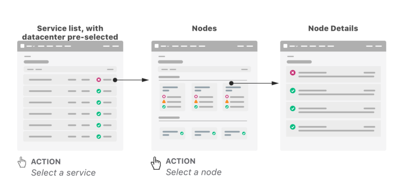
- Users prefer to analyze node health by seeing their most unhealthy nodes first, and fitting as many into one view (without scrolling or pagination) as possible.
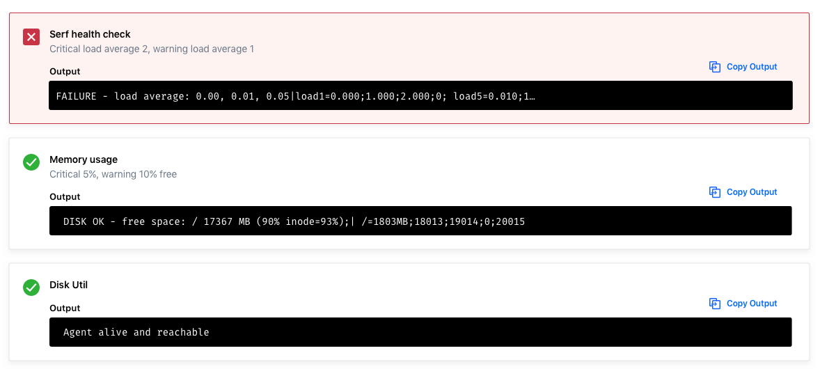
- Quick actions like copying IP Addresses and failure outputs will be time savers.
- Writing ACLs in HCL format is a learning curve for first-time users, so we can help by linking to the documentation on HCL from that form input.
- KVs in the old UI were too easy to destroy/edit by accident. We can help by making them read-only by default and adding confirmation message to destroy actions.
- The KV store will also benefit by using breadcrumbs, allowing users to navigate deeply and across layered KVs.
- As many as 8% of our users could be color blind, so making sure success-failure states are readable without red-green sight is important.
»Final Designs
»User Flow Sample
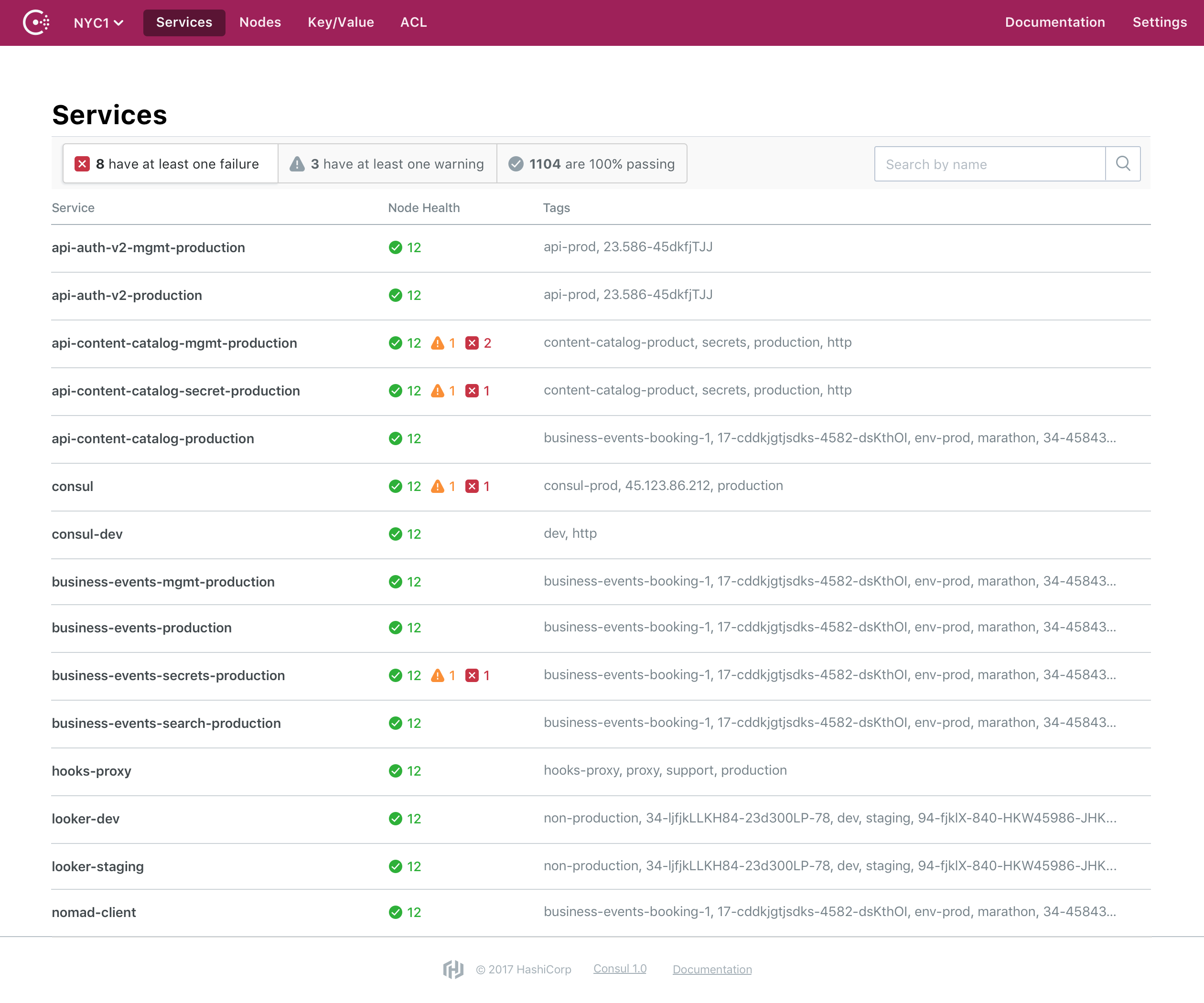
»List Layout
For lists, we aimed for information density that still felt simple, and quick filtering that wasn’t an overwhelming amount of options.
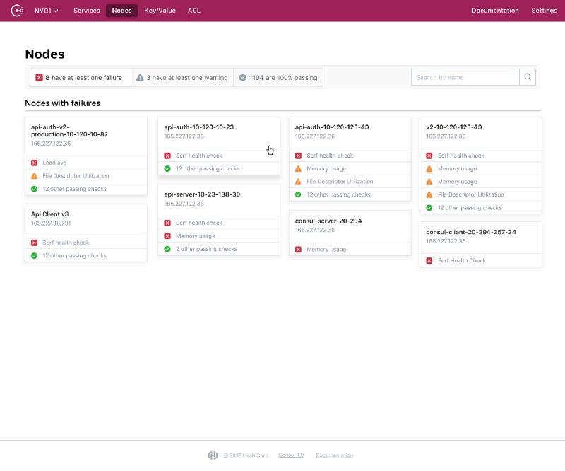
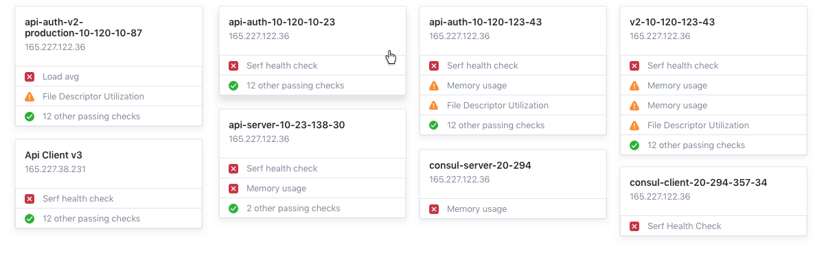
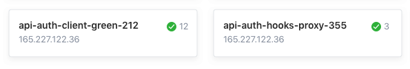
»Dashboard Layout
In order to show a variety of Node health information, we went with a card layout. The goal again, was to show quite a bit of information without overwhelming the user, and give them the ability to simplify their views through quick, intuitive filter options.
»Visual Design
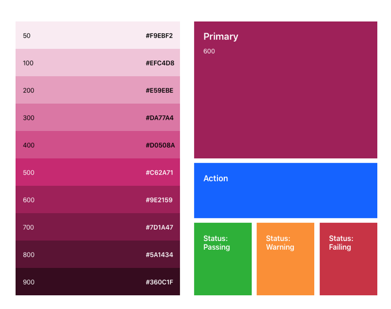
»Color
We chose a primary magenta based on a few considerations: it needed to be dark enough to avoid soft pink but light enough to still be magenta--not purple. We also had to implement it in a way that didn’t compete too much with red, which is used throughout the tool to indicate failing status.
So, we chose Magenta 600 from our brand swatches as the primary web color, and used the same blue action color that we’ve employed in our other products.
»Icons
We designed our status icons with color-blind users in mind. The set offers three affordances, or clues about what an object represents or how it can be used. Not only the color, but also the background shape and the icon itself all help to differentiate each status symbol, helping everyone easily scan dashboards for alerts.

»Cards
Unlike table layouts, cards can show unique information for each item listed and can be optimized in interesting ways for easy scanning. Cards also provide more flexible space for each item than a classic table layout.
»Next Steps
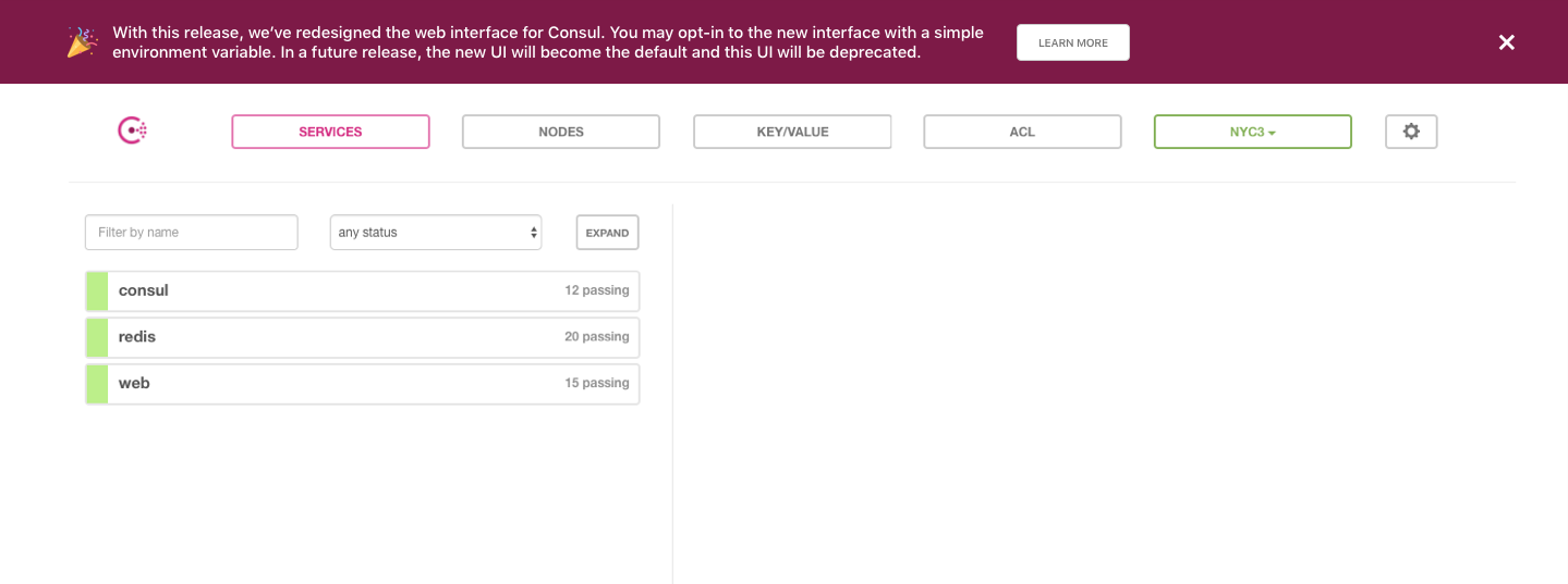
Our engineers implemented the redesigned styles for the Consul 1.1 release, where the visual update is available by opt-in. You’ll see this deprecation warning in the old UI.
For Consul 1.2, the new styles will be the default. And don’t forget--we’re always open to feedback on the Consul UI through Github issues. Thanks for reading!


